Enjoying this issue?
Get tomorrow's AI & engineering digest in your inbox — hand-picked, summarized, and always spam-free.
TLDR
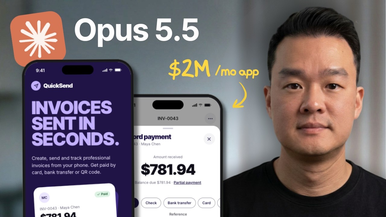
Claude Opus 5.5 can build a functional iOS app, landing page, and motion graphics video from a single prompt, with performance that the presenter claims rivals Fable 5.1 while costing 40% less than Opus 5. The key to getting quality results is providing detailed design references—like design system extracted from Refero.design—and using a specialized skill called Brag (from GitHub) to guide the model in creating product launch videos. The presenter demonstrates cloning a $2M/month invoice app, applying a new color theme from the Wise design system, and generating a 20-second launch video, noting that results improve dramatically with the Brag skill versus without it.
Key points
Claude Opus 5.5 created a 22-screen invoice app from a single prompt with one reference URL.
The model applied a new color theme from the Wise design system across all app pages.
A handheld prompt compressed 200,000+ tokens of project context to start a new chat without losing continuity.
Claude Opus 5.5 generated a landing page with motion graphics using the Hextrix MCP for images.
The Brag skill (open-source GitHub repo) created a 20-second product launch video animated entirely from code.
Tools mentioned
Techniques
- Using design system extraction (from Refero.design) as a reference to avoid generic AI styling
- Handoff prompt compression to preserve project context across fresh chat sessions
- Invoking a specialized skill (/brag) to generate structured motion graphics videos
- Using a reference video URL to guide video style without explicit scene-by-scene instructions
Stop scrolling. Start reading smarter.
Receive the day's most important AI & engineering updates in one concise email. No spam.
Transcript (captions)
I've been playing around with Opus 5.5 for a few days now and it's been blowing my mind and Anttopic said that it's on par or even exceeds Fable 5.1 in performance while costing 40% less than
Opus 5. So, I got excited and I put this to the test and with just one prompt, it built a fully working iOS app. And not only that, but it also gave me a beautiful landing page using the same
design theme as the app. And as you can see, the quality is just insane. Now, what's special about Opus 5.5 is its ability to create motion graphics videos like this entirely using code. And I've
never been able to create videos this good until now. So, in this video, I'm going to show you how I'm using Opus 5.5 to build all these things. And I also want to show you this one specific skill
that I found that can immediately make your results 10 times better than everyone else's. Let's get started. All right. So, first of all, I've been using a lot of Fable 5.1 to do most of my
projects. And while the model is very capable, it feels a bit restrictive cuz I've been hitting my limit pretty frequently even though I'm already on the max plan. But I got to say when I
was using Opus 5.5, I noticed two things. First, it feels incredibly fast. I mean, the speed at which it responds to you and the time that it takes to do certain things, it feels a lot quicker.
And also, I've been using it quite heavily in the past few days and I haven't even hit my limit even once. So, it feels really good and I don't have to keep stopping and waiting for the limit
to reset. Now, today I want to test its capabilities in terms of building and designing apps, cuz that's what we do on the channel. And for today's example, we're going to rebuild this app that is
apparently making $2 million a month, which is pretty insane. And what this is is basically a simple invoice maker. And I was actually initially surprised that there's a market for this cuz there are
already huge accounting apps like QuickBooks, Zero. But the more I studied the app, it kind of makes sense cuz the target market here is contractors and service providers, people that are
actually on the go. And these people need a quick way to spin up an invoice. And most of the time they don't have a laptop to log into their accounting software to create an invoice. So an app
like this would be very convenient for this group of people. And I thought this would be a great example to test the capability of Opus 5.5. So in this video, we're going to build three things
here. Number one, we're going to clone this iOS app with all the features, all the functionality. Apparently, this is not a simple app, so it has a lot of functions. So we're going to see how
Opus thinks through the different scenarios here. And number two, we're going to build the website for the app and also a product launch video cuz this is what you see on X whenever there's a
model release or product launches. We're going to recreate something like this for our iOS app. All right, so I'm going to start with a fresh session here and I connected it to a folder that I called
quicksand. So I'm just going to call this iOS that we're building quicksand and I'm just going to paste in my prompt here and I'm going to go through what I have here as the prompt. So I'm going to
call the claw design skill which you can easily do by typing /design and I say design an iOS app called quicksand. It is an invoice maker and I want you to grab all the features and functionality
of this app invoice maker and I want the same exact functionality. So my prompt is as simple as that. But I'm attaching two things here which is the link to the app store which is this page here and
also the landing page for that iOS app which is this one here. so that it can crawl the website and reference all the features here and grab it for our own app. Now, the third thing that I'm
adding here is some design direction of what I want the app to look like. And for this, I like to go to this website called referral.design. So, here you can find design systems for
popular apps like Spotify, Web Flow, and we got one for Zenesk, Mercury. And here you can see the design system for this app wise. And you can see that it has all the design elements here extracted
from that website. So it's going to be a lot more detailed compared to just giving Claude the URL to the wipes website because here you see all the color codes, the position of each
element. So this is information that LLMs are going to be able to read better and understand better. And I think the design here is something that we can probably use for our invoice app. So I
can either hit copy or I can simply just copy the URL of this page here and cla is going to be able to crawl everything and get all this information by itself. So that's what I did here. I said use
the design elements from wise. You'll see the design files here from this link. I want you to use all the design language and fonts and I just pasted the URL here. Now of course for a real
project you don't want to copy everything exactly 100%. But I just want to show you how good the results can be when you give it that much detail in terms of references. Now I'm going to
keep the effort level as high and I'm just going to hit go. Now in just a few minutes it's ready. The design mockup is live here. But before I click on this I want to show you what it's able to
create. So it's got 22 screens and list out all the features here and it did apply the Y style as well. So I'm going to click on this one here and I can see the canvas here and I'm just going to
zoom in to see all the details. Right. So it actually categorized all the pages here. This is onboarding. This is how to create an invoice. This is how you're going to preview the invoice. And I
personally use the Wise app. So I can say for sure that this definitely looks like the Wise app. Now, this is not the best way to preview the app because I want to be able to click through all the
buttons and see how the pages interact with each other. But this is just what the cloud design skill will give you inside the Cloud Code desktop app. Cuz here you can make changes. You can click
on any of these elements and make changes manually. But what I like to do is actually to ask it to preview it on local host. so I can actually interact with it. So what I said is basically can
you serve this on local host so I can preview and navigate test all the buttons and make sure the mockup is clean and make sure that all functionality works. It gave me a URL
that I can click now and open it in the browser and now you can see that it is in much better view and it's also given me a navigation bar on the left here which is kind of new something that I
didn't ask for but it's just nice to be able to see how the pages are categorized. So I can now click through all the elements here and see whether all of these connect to each other. So
if I click on a particular invoice here, I can go to it and I can see all the details here. Can mark as paid maybe. Yep. So all of these are editable. I can select the method of payment and I can
record the payment. Okay. So this is what the screen will look like when it's successful. I can click done and I've got reports here which looks really good actually. So I can click through. Okay.
That's not working yet. Overview by item. Yeah, this is really good. And account options, I can toggle this on and off. So, all the buttons that it created actually works. And this is
something that I had to use Fable for to get this level of quality. And I just love that it used the colors and the design of the Wise app. I think it's a good starting point cuz without using a
design reference, it's probably going to default to the color theme, the buttons that it's going to give to everyone else. So, if you want to make your app unique, this is the step that is
crucial. But if you really want to publish this app, of course, you don't want to just use Wis's colors here because people are going to spot it instantly. So, what you can do is you
can ask Claude to still use the design elements here, but maybe just change the color theme. So, what I did was I asked Claude to give me three different color variations. I said, "Hey, I want to
change the color theme, but I want to keep the design language. Please suggest three color variations." And it gave me a couple of color options here. And I love how it's showing all these widgets
here. So I can visualize the colors instead of just imagining what violet looks like or what yellow looks like on this app. So I think this is a nice way to preview the colors. And I think out
of all these options, maybe we'll pick this one, violet and lilac here. So I'm just going to click on apply this. And it will automatically create the prompt for you. And I can just hit go. And just
in a few minutes, it actually changed the color for us. Quick ad break from our sponsor Omniscent. If you're running a small business right now, you know how important it is to have an email list.
It's a direct line to your audience. But actually managing that email list can be timeconuming. Even for my own newsletter, I have to keep checking my open rates, figure out how to analyze
all the data. Plus, I still have to find time to write the content. Well, Omnisign just fixed all of that and help you manage everything on one single platform. And what's interesting is that
they just released Namcp connector for claude and CHBT, which means that you can manage your entire email operation directly from the EI tool that you use every day. So instead of going through a
separate dashboard trying to figure things out yourself, you can just go to Claude and ask, "Hey, how did my email campaigns perform last month?" And because Claude is connected to
Omniscent, it knows exactly how many emails were sent, the open rate, the click rate, and how much revenue you made. Or you can ask, "Which automation is making me the most money?" And it now
gives you all the data without you having to look it up yourself. Or you can also ask, "Are my subscribers growing or dropping off?" And it gives you a full snapshot of what's been
happening with your subscribers and even gives you recommendations. And if you go to their website, you can even grab all these prompts that you can immediately use to see some of the interesting
things that you can do with this connection. And by the way, there's already 150,000 brands that use Omnisand. And even if you're on another platform, they'll help you migrate
everything in just about 5 days. And if you guys want to try this out, you want to click the link in the description below and use code Jason Lee and you'll get 30% off for the first 3 months.
Thanks again, Omnisan, for sponsoring this video. Now, back to the content. There you go. So, we've got the new color here. And if I go through all these tabs here, you can see that it
actually applied the new color theme to every single page, every single element here. And I think this looks amazing. And the good thing, it didn't change any of the design elements here. All the
spacing, the buttons look the same, but only changed the color, which is exactly what we want. Now, I'm not going to wire wrap the back end of this app here cuz I want to keep the focus of this video on
design. So, I'm going to now ask Opus 5.5 to create a website to promote this app based on the features that we already have here. Now, before I give it the prompt to create the landing page, I
want to start a new chat. So, it has the full context windows. So, if you look here, we're already at about 200 300,000 tokens in. And I feel like around the 300,000 mark, it gets stupider if you
give it more projects to do. So, I kind of want to reset this context window so we can start fresh. But I also wanted to have some context in what we've built before so it can understand what we're
trying to build and grab that information to build our landing page. So what I typically do when I start a new chat is I give it this simple prompt. I want to continue the project
but start a new chat. Can you give me a handoff prompt that includes all the context of this project. So what it will now do is actually it was going to compact everything into this empty file
called handoff which is going to contain all the project files, all the colors and all the instructions that I've given it in this chat. It's going to compact it to this MD file here. And then it's
also given me a prompt that I can now just copy and bring it into the new chat. And it's going to read this MD file and understand what we've built so far. So what you can do now is open a
new chat and simply paste in that prompt. And you just want to make sure that you're still in the same folder. And you can hit go. And now it's reading all the project details and it
understands everything we built so far. And now we're ready to prompt. And my prompt is also very simple. Here I'm invoking the claw design skill again. Create a landing page for the iOS app to
display all the features. Use motion graphics, animations, videos to create the best landing page. Treat this as your resume on how good you are in web design. And I ask you to use Hicksfield
MCP to generate any images or videos. Again, you want to use Wis's design elements to design our landing page. Fast forward to a couple minutes. It actually built out the landing page
here, which we're going to click. There you go. I think this looks really good. and it took a lot of the design cues from the Wise website with this money transfer thing, but it's adapted to our
um invoicing app. Obviously, I feel like this hero section is quite clean here with the colors and it doesn't look vibe coded at all. And if I go down here, actually gave me this scrolling thing
that I didn't ask for cuz you saw how simple my prompt was. And if I scroll down a little bit more, it actually used Xfield to generate all this images here. And I think this looks really good. And
if I scroll down more, there's just more features with the same type of theme. And this is looking really good as well. And this looks amazing as well. And let's look at the next section here. All
right. So, I think this is a preview of the invoice, which looks really good as well. I mean, all of this is done with code. It's not a video. And if I scroll down a bit more, all of these are
animated as well. So, this sections actually react to my cursor as well, which is nice. They've got the pricing here. And let's see what else they have here. FAQ also an image of the app. I
think first version it looks amazing. Let me know what you guys think in the comments below. So if I go to the Weiss website, I just want to see which elements it took from this website here.
And here is the calculator that it took inspiration from. And if I scroll down a bit more, so here are the features section which is similar to this one. So you can see that this is rounded as well
with this pill down here. And it took that from this section here, but it didn't copy it exactly, right? Which is really good. And we've got the same one here with this uh floating pill here on
the phone, which I think looks really good. So yeah, I think what I like about this is that it's able to crawl this website and think about the features that you can use and adapt it to our own
product. So I can't stress how important it is to have some kind of reference when you're building something like this. So it doesn't matter what model you use. If you don't want your design
to look like everybody else's, you want to give it a good reference. All right. So, next I want to create a motion graphics uh like a product launch video to promote the app. And you see this a
lot with Claude when they're releasing new AI models. Now, I've been fascinated with product launch videos like this and I've been wanting to create something like this with Claude, but haven't been
able to get to the level that I'm satisfied with, but OBS 5.5 actually blew me away with this. Now, before I start prompting it, I actually found this skill called the Brag that actually
helps you turn any project into a 20- secondond launch video. And this is actually a free skill that you can download from GitHub. And you can see from the website some of the videos that
it's able to create. And this video here is also created using that scale. So I want to put this to the test for our own product. So you can actually go to this GitHub repo here and ask Claude to clone
or install this repo on your machine. And I'm going to link this in the description below if you guys want to access it. And once you have it installed, you can just invoke that
skill by typing /brag and say create a dynamic 20 second product launch video for the quicksand app. show what an incredible motion designer you are like it's your show re for a resume go all
out and because I'm still in this folder quicksand it's able to grab all the images our mobile app screens the website and that's the reason why we create the mobile app and the website
first before we create the product launch video and just in a few minutes this is what we get so I'm going to play this Yeah. So, I think that's amazing
considering that I didn't even give it any reference videos to follow. But let's see if it can get any better if we give it a reference video. So, I found this product launch video from Muse and
I think this looks super good and I want to use this as our reference video and see if it can follow it. But first, let me play this video. All right. So, it's kind of like a
minute 23 seconds. I'm not going to play the whole video, but I think you get the idea. But what we're trying to get is just a 20 second product launch video, but based on this style, which I think
looks super good, and I think this would cost a lot of money to create. So, what I did was just copy and paste that link to that video and ask you to watch it. Watch every frame to understand the
motion graphics in detail. And I want to create a launch video like this but adapted for our app quicksand. Use the bra scale to create a dynamic 20 second product launch video for the quicksand
app. And again I told it to show what an incredible motion designer you are. Go all out. And a couple minutes later this is what we get. And I'm actually going to make this full screen so it's easier
to see. [snorts] Wow, I'm really impressed with this. So, I think this looks really, really good. I've never been able to create a motion
video that is this good actually. And I particularly like this chat bubble here, which I think looks super good with this confetti here. And considering that my prompt was very simple here, this is
really impressive. Even though I did find a couple of mistakes here, if you notice, the card is actually covering the word make here. But I guess this is something that can easily be corrected.
You can take a screenshot and ask it to make a correction. But yeah, I think this is just really good. It took the logo and all the features that we have built for our app and built the entire
thing. Now the big question is how do you edit something like this, right? Cuz I didn't give it any direction in what it should display scene by scene. So what you can do is actually go to claude
and ask it to break down the video scene by scene. So it will actually give you more details in what it's going to display, what text is going to show and that is where you want to make your
edits so that the video will be generated to the standard that you want. But one thing to remember the trick to getting that level of quality for the product launch videos, you want to pair
this skill here with Opus 5.5 because I also ask it to create a motion graphic video just by giving it a website here. So I ask it to create a launch size video for notion using the scale. This
is the actual website for notion. And this is the video that it was able to create by just giving it that URL. And I'm going to mute the audio here. And just look at how it's able to pull all
these icons here from the website. Yeah. So, I gave it nothing else besides the URL. And look at the result. And just as a comparison, I also asked it to create the same video for Notion, but
without that brag scale. And this is the difference. So, not bad here. But some of the fonts here are not accurate. It's not able to pull every single thing from the
website. And especially this scene here does not look anything like Notion. Yeah. And even the logo here is not accurate. That skill is actually the thing that will guide Opus 5.5 and give
it the instructions to actually pull all the assets from that website. So everything's on brand and it will make your output 10 times better than everybody else's. So that is all for me
today guys. If you guys enjoy breakdowns like this, make sure you subscribe because I do these videos weekly. Thanks again and I will see you in the next